Insider Secrets to Selecting Colors: Nature Spun Yarn
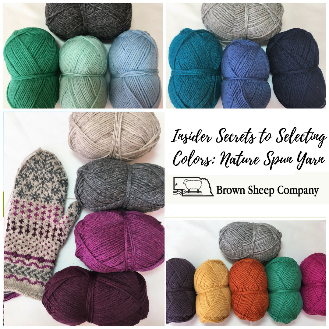
With more than 80 colors to choose from, selecting color palettes can get a little overwhelming. Today, we’re diving into Nature Spun because it’s so versatile: if you find a color combination that appeals to you, we make Nature Spun in fingering, sport, worsted, and chunky weights so that any project you can imagine can be put together.
I’m going to share some “insider secrets” based on how the colors are formulated, and how their “color recipes” affect the way they coordinate together.
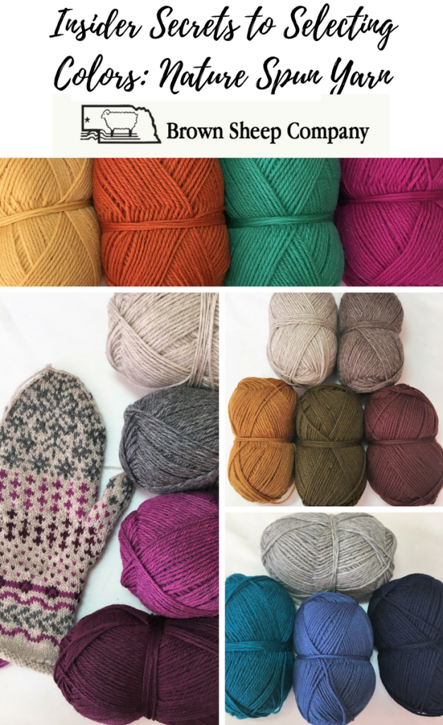
The first step in selecting a color palette is choosing a base color. The purpose of the base color is to take the backseat to your “pop” colors and allow them to draw the most attention. If you select a lighter-value base, you’ll want to go with medium to dark pop colors for contrast. Conversely, for a darker base, you’ll need to choose medium to light pop colors. It can be tempting to go all-out and choose all brights, or play it safe and stick with all neutrals, but I find the magic really happens when you mix some of each.
When we create many of the Nature Spun colors, we begin by blending white wool with a little bit of brown or black roving:
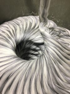
Blends of black and white create a “cool” gray. You’ll notice our cool toned grays, 03 Grey Heather and 880 Charcoal, look especially good when paired with cool hues like blue, green, or purple, as well as very bright colors.
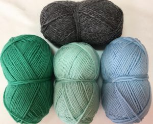
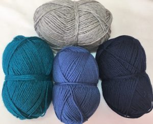
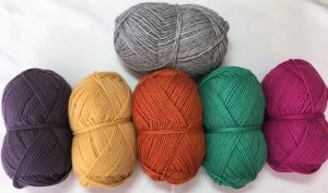
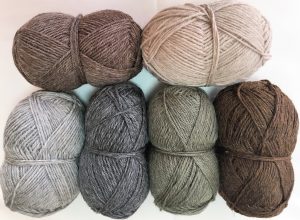
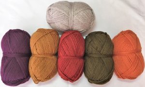
Blends of brown and white create a “warm” gray. So, our warm neutrals including 720 Ash and 701 Stone pair best with more muted colors and shades of red, orange, or gold.
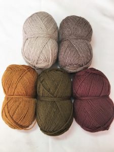
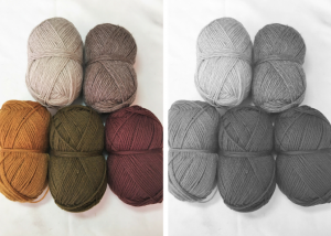
For the pattern you’ve chosen, consider how much contrast is needed between your colors. Try taking a photo and filtering it in black and white to see if there’s enough light/dark contrast:
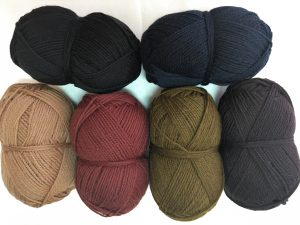
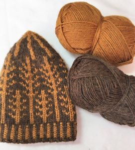
Or, here is an example of a project that has just enough contrast for the pattern to show. The 2 colors are both blended with brown, so they melt together nicely — I thought this gave it a nice masculine feel (This is the Banff Hat by Tin Can Knits, made for my husband!)
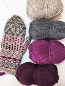
A major advantage of having 80 colors to choose from is that you can go for gradients– try a few neutrals along with several pop colors that flow from light to dark. Here I chose a light and dark neutral, along with a light and dark shade of magenta for the Shortest Day Mittens by Susanna Winter (clearly still a WIP!).
Most importantly, trust your intuition when selecting colors! Try different combinations and choose the one that makes you most excited to cast on and knit away.
Like this post? Pin it!
